Thursday, October 26, 2006

Project 2 - final touch ups and problems

Scroll Bars

Qn: Why is it that when i add in the scroll bar, the background is always white? No matter how i try to change the background colour, it still looks white when i tested it out on the web browser? What should i do?

Qn: Can we add scroll bar to a 'table'? How?

- Decided not to add in the scroll bars. I had spent too much time on trying to resovle this problem (about 2 days). Should resolve other problems too.


Images

- Didn't manage to take photo of some other types of dishes (e.g duck, chicken etc.)
- went online to search for the images but can't find what i wanted.
- recalled that for some webpage, when the image is unavailable, they would put 'temporary unavailable'. hence, i created and image of 'temporary unavailable' to substitute the missing images, hoping to make the website looks more complete and professional.


Webpage

- one of my main aim for this project is to create a website that looks professional and error free.
- by saying error free, i am referring to things such as:

* when we browse the webpage, the webpage does not 'move'or the items on the webpage does not 'jump' or 'move' when we switch the pages.
* the links on the website works well and there are no broken links.
* the website can be viewed using many types of browsers such as Internet Explorer, Safari and Firefox

- i am proud to say that i have achieved my goals.

Tuesday, October 24, 2006

Project 2 - final touch ups and problems

Scroll Bars

Qn: Why is it that when i add in the scroll bar, the background is always white? No matter how i try to change the background colour, it still looks white when i tested it out on the web browser? What should i do?

Can we add scroll bar to a 'table'? How?

- Decided not to add in the scroll bars. I had spent too much time on trying to resovle this problem (about 2 days). Should resolve other problems too.


Images

- Didn't manage to take photo of some other types of dishes (e.g duck, chicken etc.)
- went online to search for the images but can't find what i wanted.
- recalled that for some webpage, when the image is unavailable, they would put 'temporary unavailable'. hence, i created and image of 'temporary unavailable' to substitute the missing images, hoping to make the website looks more complete and professional.


Webpage

- one of my main aim for this project is to create a website that looks professional and error free.
- by saying error free, i am referring to things such as:

* when we browse the webpage, the webpage does not 'move'or the items on the webpage does not 'jump' or 'move' when we switch the pages.
* the links on the website works well and there are no broken links.
* the website can be viewed by many types of browsers such as Internet Explorer, Safari and Firefox

- i am proud to say that i have achieved my goals.

Sunday, October 22, 2006

Blog skins

visited some of the classmates' blog and realised that 3 of us has similar blog skin! ha.. wonder why. I chosed this blog skin out of the rest is because of its good colour combination, its design (white dash as frame to frame up the post) which is very neat and green is good for your eyes! ha..

But i also realised that because i am using the Beta version, my blog looks a little different from the others who are using the same design. Both looks fine to me and i don't think it matters much. the only thing that i am worried about is the tool button Photobucket - Video and Image Hosting that is on the right side of this blog. it seems that anyone visiting this blog can click on it and make changes to the side bar. Wonder why did blogger made it so?

Project 2 - Change the layout from ' layers' to 'tables'

Phew... Managed to re-construct the layout using tables. Realised that it is actually much neater and easier to do editing! Regret not changing it earlier! But better late than never.. Spent 2 full day to do the editing but its worth it. BUT, new problems come out. example would be that it is hard to position the images at excatly where i would like it to be due to the boundaries of the tables. Still resolving the problems.

Thursday, October 19, 2006

Project 2 - Changes

Received many good feedbacks today. Found out that my webpage looks messy because i did not align the text and images well enough. Another reason is also because i had used too many different types of font within the webpage. Hence, I would like to do the following changes:

- limit the types of fonts used in the website to 2, maximum 3.
- align the text and images properly.
- if i want to align the text and images, i MAY need to re-draw the layout in 'tables' as i have a feeling that editing the alignments with layers may be a big problem. I may even take less time if i re-draw the layout in 'tables' (hopefully i don't need to do so!)

Monday, October 16, 2006

Project 2 - problems and solutions

1. Design

- struggling with the design. I want the website to have an oriental look but it would result in the webpage looking very messy and confusing. Tried to simplify the design and the webpage ended up looking too 'mordern'. Stuck.

2. Editing

- editing is really hard. When i move a certain box or image, the other things would also shift at the same time. As a result, i cant do much editing with the wedsite even when i am not satisfied with some parts of it. Found out that this usaually happens when i use 'layers' instead of 'tables' when i did the layout of the webpage. presentation is few days away. Would try to change the layout into tables if i can afford the time after the presentation on this thurs.

3. Images

- the images didn't turn out as good as i would like them to be. The colours of the images differs when i view the webpage in different browser. I had un-tick the boxes when i save the images as JPG for web, but the same problem still exist.

Tuesday, October 10, 2006

Adding links and tags

hurray! found the way to add in the link for my site meter! And i have also found the way to add in the advertisement tags! Didn't realise that it can be so easy. Maybe this new beta version is better afterall..

Blogger Beta

Blogger Beta has its pros and cons. saw the Pro on 06/10/06 but when i want to add back my original links to my site meter and some advertisement tags which i mentioned in my past post, i cant add them in at all. This is how the new template page looks like:

Photobucket - Video and Image Hosting

Tried to edit using the html instead of the one above but the html code is simplified to such an extend that i cant find where the part for the links section is. Kind of regret changing it to Beta version now. But its a new experience. A very troublesome one.

Friday, October 06, 2006

new blogger - Blogger beta

i tried out the blogger beta today just to see what kind of tools it provides and comparing it with the older version. i feel that this Beta version would make blogging much more easier to people who has no knowledge on web design at all. This new version even allows user to change the colour and layout of the blog very easily, with guided tools. However, as it is a Beta version, all the tags that i had added to my blog previously were gone and some, like that site meter, could not be replaced at the moment (it could not deta my account in blogger as my present account is under Beta Blogger which is not available at the Site Mtere's site yet.).

Thursday, October 05, 2006

tutorial notes - Content Management System (CMS)

Free stuff

Linux
Apache
Mysal
Php
_________________________________________________________

JAVA -> Free/Commercial
J2EE
ASP -> Microsoft
ColdFusion


Related links:

CMSMATRIX -> good tool to find out stuff for CMS
open source CMS -> try out Mambo

Mambo:
- easy to set up and use (sells itself as)
- but tend to make things very genaric (?)

Joomia:
- similar to Mambo

Drupal:
- GOOD
- widely used (used by Bill)
- flexible
- can tag your information
- searchable (have search tool bar on your site)
- publishing option available (post can be chosen to be 'public' or 'private') <- nice!
- can create content, upload video and images all in one website <- cool!
- can have different style sheet for different types of post (easy to edit and set to your own preference) e.g set up rules and fonts etc...
- themes that can be configured (but customizing it is not that simple!)

Plone (wrong link.. to be edited)
- powerful system
- easy to run

wordpress (to be edited)
- widely used for blogs


Note: for web journal, making it for viewers to access you stuff easily can be a bit tough. Hard to arrange. (But i shall try and challenge it..)

Saturday, September 23, 2006

Project 2 - idea (updated regularly)

This is the draft of the design of the webpage that i am going to do for Project 2.

Photobucket - Video and Image Hosting

Background colour for this draft is too orange and would need to be changed. Some kind of border would also need to be added so that the webpage would look neater and more organised.

Target Audience

The webpage that i am going to do is a webpage for a chinese restaurant in Hobart, called Dragon Palace. Target audience for this website would be tourist and locals who are searching for [chinese] restaurant in hobart. This website would most probably be linked to the Yellow Pages's website as most people would go to yellow pages to search for restaurant. Google is another website that this website should be linked to as many people search through Google too.

Colour

Red and Yellow would be used as the colours for this website as many would relate Red and Yellow (gold) as the 'Chinese colour'. In this way, any visitor who visit this website would be able to associate it with 'Chinese' on his/her first glance.

Problem: I have never used coloured background for web design at all. Have some difficulty, especilly with the buttons. Website would look either too plain or too fanciful. wonder why. Hard to come out with a good design.

Solution: Create the buttons with a coloured background (same as the colour of the background). Trial and Error.

Images

Decided to take the photgraphs of food myself. Do not want to use any images that are online. Why? Because this website may be linked to Yellow Pages and Googles for real advertising purposes. Also, as the designer for this website, I would have a brief idea of how i would like to position the images and what images I would need. Hence, taking my own photographs would be better.

Problem: Most of the images are closeup shots of the food as it makes the food look nicer as the image would be more professional looking. However, due to the closeup, some of the food can't really be recognised easily by others. Also, realised that dishes with more colours (especially green) such as the Mixed Vegetables, looks much better on the webpage.

Solutions: Try and take images with more greens in it. Adjust the colours such that it makes the images of the food look more visible. Try and take the pictures with 'others' in mind (images are supposed to be looked at by people who has never seen the food before). Trial and error!

Thursday, September 21, 2006

site meter

set up a site meter today jus for fun. jus playing around with the types of 'tools' specially designed for blogs as a further exploration of my presentation topic.

the reason for me choosing this site meter instead of the others available is because i find it offers a more in dept record of the visitors to the blog especially the part where i can find out which country the past visitors that read my blog came from. click on the site meter at the side of this page to explore more on it.

Wednesday, September 20, 2006

website presentation update

Mures also has a blog and uses it as ! wow.. i guess the function of weblog has really changed..

Mures Blog
Mures Store

Tuesday, September 19, 2006

website presentation follow up - Advertising with Blog

examples of companies using blogs for advertise can be seen on the side bar where i have placed 2 advertising banner. these type of banners can be seen in many blogs today as it creates a 'win-win' for both the bloggers and the advertising companies (bloggers can earn points or rewards by putting up these banners in their blogs and advertising companies can attract more customers) i feel that this is another reason why the role of blogs has changed so successfully.

website presentation - Blogs today

What is a blog? (today)

Blogs used to be an online diary where people would keep a running account of their personal lives but its function has changed in recent years.

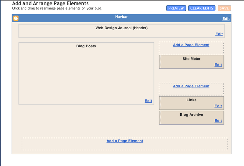
I feel that the main reason for role and function of blog to change is because of how easy it is to set up a blog and edit or personalise it to each person's own preference. An example would be that we can easily upload photographs and video onto our blogs with websites such as Photo Bucket. Designs of blogs are also availble for free at BlogSkin. Hence, anybody who has a bit of creativity and spend a little time to learn some basic web design skills can turn their blogs into a designer's webpage.

Blogger has also 'upgraded' itself with a newer version to make blogging even more easy and private.

22 years old Wendy Cheng, a very famous and popular Singaporean blogger who’s blog receives around 16, 000 visits a day, would be the best example to show how functions of blogs evovled into what it is today. Wendy started using blog as an online dairy ( a dairy that cant be thrown away) but as her blog gains more readers, the design and function of her blog changes.

Blogger becomes celebrity

Her blog Xiaxue has been awarded the best Asian blog for three consecutive years – year 2003, 2004 and 2005 – and her blog is gaining more readers every year. Not only has her blog become famous in Asia, her blog is also slowly gaining fame internationally and because of that, Wendy has even become a celebrity in Singapore and was treated as a V.I.P in many places in Singapore.

Celebrity becomes Blogger and using Blog as a place for advertising

Another famous blogger, Xu Jing Lei, a China actress and also a director also owes her fame and success to her blog. Her blog is known to be the most visited ones in china with a count of more than 50 million visits and the visitor count is still growing in numbers rapidly. When working on her latest work Dreams May Come True, Xu detailed the film's daily progress in her blog and it has proven to be the most effective promotion for such an art house film. From these, we can see that blogs now have actually become another place or tool for self or product advertising and it is also proven to be very effective, especially with a popular blog.

Another example that is more applicable to Australia would be Jake's blog . Jake is one of the participants in the show 'Dancing on ice' and i believe that his blog does helped him a little with gaining more popularity and support. The fact that Jake actually created a weblog to blog about his participation in the show, proves that blog is no longer as simple as an online dairy.

other related links:
Blog news
Boing Boing - famous blog that looks more like a webpage of news report
Tony Pierce's Blog

ps://we were encouraged to set up a weblog to be used as our journal for this course - Web Design - and i was very shock to heard that at first. This is the main reason that lead me to think and look at the function blogs today.

Saturday, September 16, 2006

Project 1

the webpage i have designed for this project is an online catalogue for an imaginary art exhibition called Journey to the West which would be used to advertise this exhibition online and to provide the basic information to the Internet users who would be interested in going to this exhibitiion.

Home Page Page Format

Photobucket - Video and Image Hosting

this home page is designed such that it provide all the most basic information of this exhibition - the title, date, location and participating artists of this exhibition.

the logo of this exhibition is located at the top left hand corner, and there is an animated banner of the participating artworks and the name of artists at the top of the screen so that no matter what screen size the user is using, the viewer should be able to get a rough idea of what kind of webpage he/she is looking at.

Exhibition Information Page Format & drop down menu design

Photobucket - Video and Image Hosting

grey and light blue is chosen for the drop down menu to that it sits in with the colour of this webpage.

Participating Artist Page Format

Photobucket - Video and Image Hosting

Link button to participating artworks and addition web links on artist's information is position at the bottom of the webpage so that viewers can go to any other parts of the website within a few clicks.

Participating Artworks Page Format

Photobucket - Video and Image Hosting

similar to the artist's page, the artworks page also has links to the artist's page and related web links page for easy navigation. viewer can click on the artist's name to go back to the artist's page. Artist's name hints to the viewer that it is a link as it is being underlined.

Related Link Page Format

Photobucket - Video and Image Hosting

on this page, there are some links that is related to the participating artist and if the viewer is interested in the works of that particular artist, the viewer can click onthe related links for more informations. similarly, this page offers links to the rest of this website.

clicking on the artist photo would bring viewer back to the artist's homepage and clicking on 'next' would bring viewer to the next artist's link page. viewers can also go to artist's artworks from this page. however, the 'related links' buttons would be removed as i feel that it is not relevant for this page.

Sunday, September 03, 2006

Project 1 - in process

Found out about things like how to add links, drop down menu and moving image in Dreamweaver. Main aim for this project is to learn through Trial and Error and explore what Dreamweaver can do. Being someone who is always timid and playing on the safe side, it is a huge jump for me. But i know that only by doing so, i can learn more.

Moving Image

For the top of the webpage, i have decided to add in a moving image of the artworks of the participating artists. In order to be not too annoying, i have slowed down the speed of how the image changes and i have toned down the colours of the moving image so that it would not be too striking and over powering. Main aim of having the moving image of the artworks and name of artist is to let the viewer have a glimps of the type of participatig artworks and artists when they are on the first page of this website. Having a moving image may also make the website looks more interesting?

Friday, September 01, 2006

Project 1 - concept

since we were told to develope a simple webpage for project 1, i have decided to make an online catalogue for an imaginary exhibition. This imaginary exhibition is the project for my Contemporary Art of the Asia-Pacific Region unit. As we are living in a high technology world now, and more people are surfing the web, i feel that having an online catalogue for an exhibition would be benificial for promoting the exhibtion. Also, major exhibtions such as Sydney biennale, Asia Pacific Triennial (starting from the 3rd exhibition), Singapore Biennale, have also created a website on the exhibtion.

Idea

- simple and neat (not with fanciful designs)
- easy to navigate around the website
- information is clear
- can go to any part of the website within 3 clicks
- provide all the necessary information on the venue, participating artists and artworks
- viewer can view the webpage on almost all types of screen settings
- viewer does not need to scroll down the page (for me, its very annoying to scroll down the page)

-> viewer only need to click to navigate around the website

Thursday, August 10, 2006

del.icio.us

tried out this bookmarking website (del.icio.us) and i realise that it is great! it makes bookmarking websites so easy and 'portable' where i can go to my bookmarks from any computers. i spent a few hours exploring how to use all the tools such as 'tag' and 'bundle tag' and i found it to be very very useful for a neat and tidy way to keep all my bookmarks.

also, i am wondering if this is a US website as it ends with (dot)us. if it is, it is really a brilliant name for it! and i am going to recommend all my friend to it.

Thursday, July 27, 2006

-

First Week

This is my first blog entry to this blog. Just feel weird when we were told to setup a blog to use as our journal but i find it very interesting though.

Many blogging websites were available and Flock was introduced to us during class. it looks quite easy to use but its still in beta stage. Hence, i chose to use Blogspot instead.

The other reason why i chose Blogspot was because i had been using it for 2 years and is more familiar with how to add pictures and links etc to it.

Apart from setting up a Blog, we were also told to set up a BookMarking device(?) which could be downloaded at http://del.icio.us/