Saturday, September 23, 2006

Project 2 - idea (updated regularly)

This is the draft of the design of the webpage that i am going to do for Project 2.

Photobucket - Video and Image Hosting

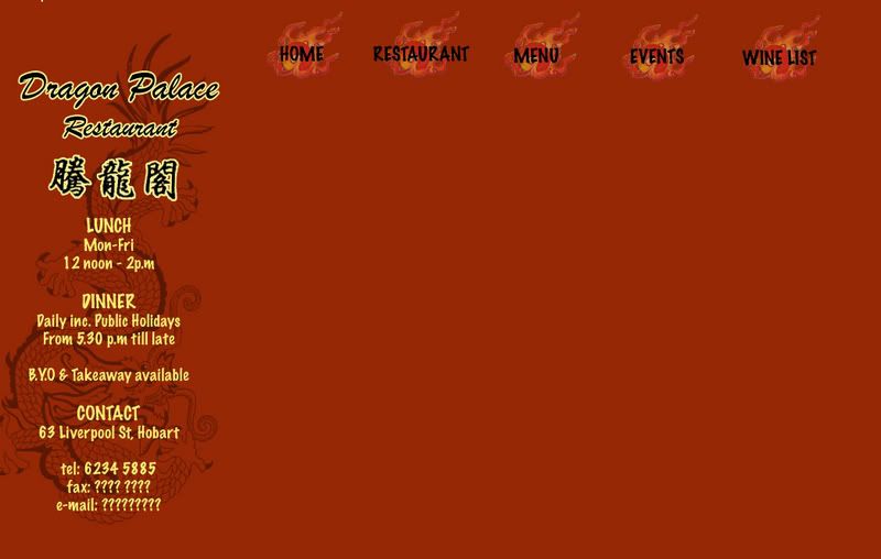
Background colour for this draft is too orange and would need to be changed. Some kind of border would also need to be added so that the webpage would look neater and more organised.

Target Audience

The webpage that i am going to do is a webpage for a chinese restaurant in Hobart, called Dragon Palace. Target audience for this website would be tourist and locals who are searching for [chinese] restaurant in hobart. This website would most probably be linked to the Yellow Pages's website as most people would go to yellow pages to search for restaurant. Google is another website that this website should be linked to as many people search through Google too.

Colour

Red and Yellow would be used as the colours for this website as many would relate Red and Yellow (gold) as the 'Chinese colour'. In this way, any visitor who visit this website would be able to associate it with 'Chinese' on his/her first glance.

Problem: I have never used coloured background for web design at all. Have some difficulty, especilly with the buttons. Website would look either too plain or too fanciful. wonder why. Hard to come out with a good design.

Solution: Create the buttons with a coloured background (same as the colour of the background). Trial and Error.

Images

Decided to take the photgraphs of food myself. Do not want to use any images that are online. Why? Because this website may be linked to Yellow Pages and Googles for real advertising purposes. Also, as the designer for this website, I would have a brief idea of how i would like to position the images and what images I would need. Hence, taking my own photographs would be better.

Problem: Most of the images are closeup shots of the food as it makes the food look nicer as the image would be more professional looking. However, due to the closeup, some of the food can't really be recognised easily by others. Also, realised that dishes with more colours (especially green) such as the Mixed Vegetables, looks much better on the webpage.

Solutions: Try and take images with more greens in it. Adjust the colours such that it makes the images of the food look more visible. Try and take the pictures with 'others' in mind (images are supposed to be looked at by people who has never seen the food before). Trial and error!

Thursday, September 21, 2006

site meter

set up a site meter today jus for fun. jus playing around with the types of 'tools' specially designed for blogs as a further exploration of my presentation topic.

the reason for me choosing this site meter instead of the others available is because i find it offers a more in dept record of the visitors to the blog especially the part where i can find out which country the past visitors that read my blog came from. click on the site meter at the side of this page to explore more on it.

Wednesday, September 20, 2006

website presentation update

Mures also has a blog and uses it as ! wow.. i guess the function of weblog has really changed..

Mures Blog
Mures Store

Tuesday, September 19, 2006

website presentation follow up - Advertising with Blog

examples of companies using blogs for advertise can be seen on the side bar where i have placed 2 advertising banner. these type of banners can be seen in many blogs today as it creates a 'win-win' for both the bloggers and the advertising companies (bloggers can earn points or rewards by putting up these banners in their blogs and advertising companies can attract more customers) i feel that this is another reason why the role of blogs has changed so successfully.

website presentation - Blogs today

What is a blog? (today)

Blogs used to be an online diary where people would keep a running account of their personal lives but its function has changed in recent years.

I feel that the main reason for role and function of blog to change is because of how easy it is to set up a blog and edit or personalise it to each person's own preference. An example would be that we can easily upload photographs and video onto our blogs with websites such as Photo Bucket. Designs of blogs are also availble for free at BlogSkin. Hence, anybody who has a bit of creativity and spend a little time to learn some basic web design skills can turn their blogs into a designer's webpage.

Blogger has also 'upgraded' itself with a newer version to make blogging even more easy and private.

22 years old Wendy Cheng, a very famous and popular Singaporean blogger who’s blog receives around 16, 000 visits a day, would be the best example to show how functions of blogs evovled into what it is today. Wendy started using blog as an online dairy ( a dairy that cant be thrown away) but as her blog gains more readers, the design and function of her blog changes.

Blogger becomes celebrity

Her blog Xiaxue has been awarded the best Asian blog for three consecutive years – year 2003, 2004 and 2005 – and her blog is gaining more readers every year. Not only has her blog become famous in Asia, her blog is also slowly gaining fame internationally and because of that, Wendy has even become a celebrity in Singapore and was treated as a V.I.P in many places in Singapore.

Celebrity becomes Blogger and using Blog as a place for advertising

Another famous blogger, Xu Jing Lei, a China actress and also a director also owes her fame and success to her blog. Her blog is known to be the most visited ones in china with a count of more than 50 million visits and the visitor count is still growing in numbers rapidly. When working on her latest work Dreams May Come True, Xu detailed the film's daily progress in her blog and it has proven to be the most effective promotion for such an art house film. From these, we can see that blogs now have actually become another place or tool for self or product advertising and it is also proven to be very effective, especially with a popular blog.

Another example that is more applicable to Australia would be Jake's blog . Jake is one of the participants in the show 'Dancing on ice' and i believe that his blog does helped him a little with gaining more popularity and support. The fact that Jake actually created a weblog to blog about his participation in the show, proves that blog is no longer as simple as an online dairy.

other related links:
Blog news
Boing Boing - famous blog that looks more like a webpage of news report
Tony Pierce's Blog

ps://we were encouraged to set up a weblog to be used as our journal for this course - Web Design - and i was very shock to heard that at first. This is the main reason that lead me to think and look at the function blogs today.

Saturday, September 16, 2006

Project 1

the webpage i have designed for this project is an online catalogue for an imaginary art exhibition called Journey to the West which would be used to advertise this exhibition online and to provide the basic information to the Internet users who would be interested in going to this exhibitiion.

Home Page Page Format

Photobucket - Video and Image Hosting

this home page is designed such that it provide all the most basic information of this exhibition - the title, date, location and participating artists of this exhibition.

the logo of this exhibition is located at the top left hand corner, and there is an animated banner of the participating artworks and the name of artists at the top of the screen so that no matter what screen size the user is using, the viewer should be able to get a rough idea of what kind of webpage he/she is looking at.

Exhibition Information Page Format & drop down menu design

Photobucket - Video and Image Hosting

grey and light blue is chosen for the drop down menu to that it sits in with the colour of this webpage.

Participating Artist Page Format

Photobucket - Video and Image Hosting

Link button to participating artworks and addition web links on artist's information is position at the bottom of the webpage so that viewers can go to any other parts of the website within a few clicks.

Participating Artworks Page Format

Photobucket - Video and Image Hosting

similar to the artist's page, the artworks page also has links to the artist's page and related web links page for easy navigation. viewer can click on the artist's name to go back to the artist's page. Artist's name hints to the viewer that it is a link as it is being underlined.

Related Link Page Format

Photobucket - Video and Image Hosting

on this page, there are some links that is related to the participating artist and if the viewer is interested in the works of that particular artist, the viewer can click onthe related links for more informations. similarly, this page offers links to the rest of this website.

clicking on the artist photo would bring viewer back to the artist's homepage and clicking on 'next' would bring viewer to the next artist's link page. viewers can also go to artist's artworks from this page. however, the 'related links' buttons would be removed as i feel that it is not relevant for this page.

Sunday, September 03, 2006

Project 1 - in process

Found out about things like how to add links, drop down menu and moving image in Dreamweaver. Main aim for this project is to learn through Trial and Error and explore what Dreamweaver can do. Being someone who is always timid and playing on the safe side, it is a huge jump for me. But i know that only by doing so, i can learn more.

Moving Image

For the top of the webpage, i have decided to add in a moving image of the artworks of the participating artists. In order to be not too annoying, i have slowed down the speed of how the image changes and i have toned down the colours of the moving image so that it would not be too striking and over powering. Main aim of having the moving image of the artworks and name of artist is to let the viewer have a glimps of the type of participatig artworks and artists when they are on the first page of this website. Having a moving image may also make the website looks more interesting?

Friday, September 01, 2006

Project 1 - concept

since we were told to develope a simple webpage for project 1, i have decided to make an online catalogue for an imaginary exhibition. This imaginary exhibition is the project for my Contemporary Art of the Asia-Pacific Region unit. As we are living in a high technology world now, and more people are surfing the web, i feel that having an online catalogue for an exhibition would be benificial for promoting the exhibtion. Also, major exhibtions such as Sydney biennale, Asia Pacific Triennial (starting from the 3rd exhibition), Singapore Biennale, have also created a website on the exhibtion.

Idea

- simple and neat (not with fanciful designs)
- easy to navigate around the website
- information is clear
- can go to any part of the website within 3 clicks
- provide all the necessary information on the venue, participating artists and artworks
- viewer can view the webpage on almost all types of screen settings
- viewer does not need to scroll down the page (for me, its very annoying to scroll down the page)

-> viewer only need to click to navigate around the website